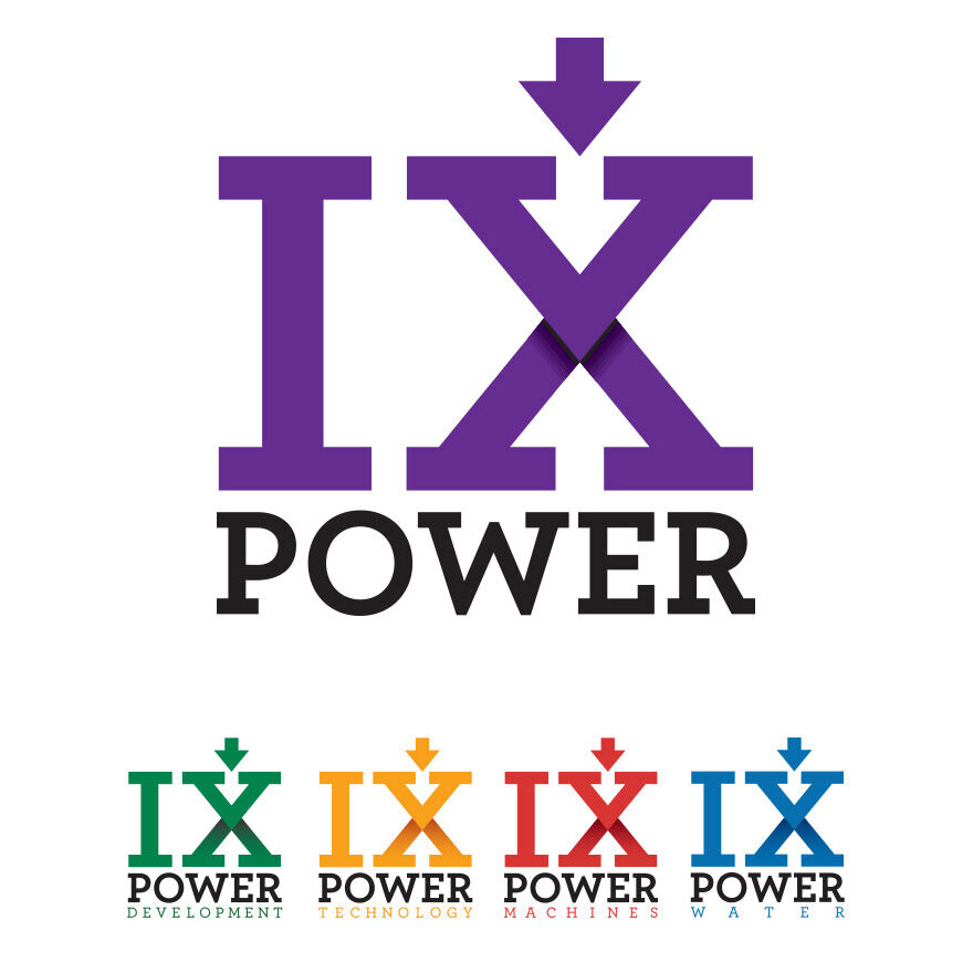
IX Power
I designed this logo as part of the corporate identity system for a clean energy startup. Located in Colorado, they productize technologies from Sandia National Laboratories. IX Power had an interesting branding problem. They are small and highly innovative, but operate in an industry that values stability over almost anything else.
I began the project the way I always do, asking questions and making very simple sketches. I follow the "there are no mistakes" philosophy of sketching. I'm just working out ideas. I go back to the sketches after a day or two to mine them for anything I might have missed in the moment. And then draw everything again. I rarely show these sketches to anyone, even a friend. I repeat this process until I feel ready to move to the computer. When I’m leading a group of designers, I try to keep them away from a computer for as long as I can. Computers impose limits. Sketching is free from any software constraints. Often, translating a great sketch into a clean design requires a bit of creative problem solving. Skip the sketch, and that problem solving is skipped—this is a missed opportunity.
Sketches & Doodles
I produced dozens of sketches for IX Power (pronounced Nine Power). This client is a bit of a showman and loved telling the “9” story. Some of the themes that emerged were power transmission, like power lines and poles, but also motion and stability. There is also a notion of multiple technologies coming together to create power.
After doing a quick survey of other companies in this market, it was clear that the logo needed to be bold. Aggressively bold.
Some of my initial sketches.
Early Designs.
The client chose the design on the right.
When I move to the computer I usually work in black and white until the basic shapes are figured out. In this case, purple wasn't negotiable. My client just really likes purple. Early on, IX Power strongly favored a 3D logo. Even though they were pushing for a 3D rendered logo, I felt like I owed it to them to keep going. This is a tricky spot for a designer to be in. The job could be done, but you feel like another round of work is needed. Proceeding can mean working on spec and possibly loosing some billable hours. Luckily, I was able to convince IX Power to spend just a bit more time developing the logo.
One of the first use cases my client envisioned for his logo was that it would be “stamped on equipment” and “plastered on the side of a truck”. After hearing that, I was able to hone in on a final design very quickly.
A mockup of the logo on a truck.
Finding out that the logo would frequently appear on vehicles was a bit of an ah-ha moment.
A one color version of the logo, ready to be stamped on equipment.
TL;DR
I used bold shapes to help an aggressively cutting edge business fit in with established power generation companies.


