Better Icons: Better UX
Icons representing the states of the Unity application
Unity: Working Together while Apart
Awareness applications provide opportunities for collaboration, even when flexible teams aren’t always working in the same location. Increasingly, the physical location of team members isn’t consistent. This arrangement can improve the work/life balance of workers, but it interferes with collaboration, especially “spur of the moment” conversations. Unfortunately, awareness applications can feel like “big brother” spying and reporting on participants. People’s fear of over-sharing is real and must be taken into account.
Our solution was to provide transparency and reciprocity. The state of your connection to the system and what all participants were sharing was always available to every participant.

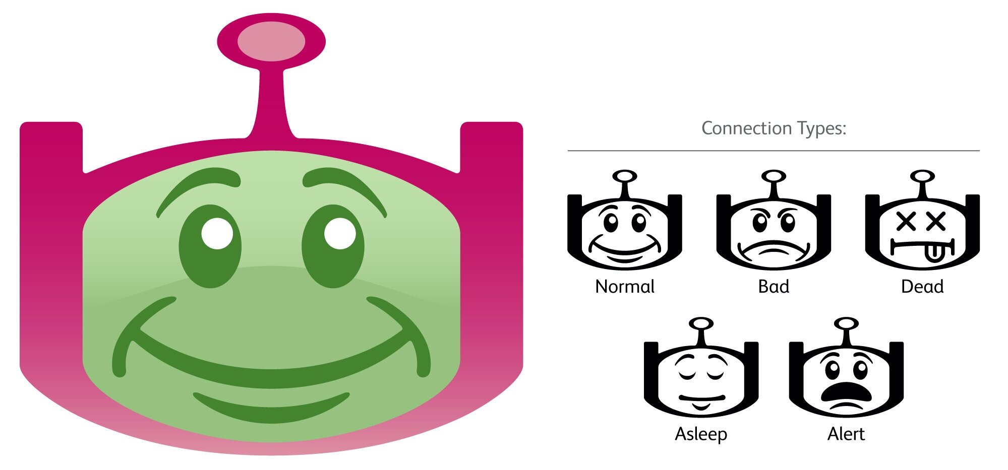
Possible states of the system
Nobody wants to be tracked by a nameless, faceless computer. I devised a simple set of icons that made use of a common fault to give the system a personality. All of these icons were derived from the main application icon. After the application icon, connections status was often the first bit of information presented by Unity. Often, this connection wasn’t “normal”. In the background the application and/or the system was always working to restore a faulty connection to normal. In the meantime, users could “click” on a humorous icon and review simple messages about the state of the system. A “pop-up” with the same icon and a similar message would appear on a major state change. In effect, this endowed the system with a level of agency. It became another participant in the group.

Obviously, the application used other icons. Each person’s tile was color coded according to their availability. This color coding was accepted & learned by users in Japan and the US because it reflected logical and appropriate user states. Availability is a rather abstract state of being that the system assigned to each participant. The sensors and sources used to make that decision were easily reviewed by any participant in the system.
A very simple and friendly set of icons was used to represent this information. Where appropriate, sharp corners and complexity were avoided.
Unity was deployed across many platforms in the US and Japan. Its improved ability to display detailed information about the status of coworkers and itself addressed many of the concerns reported by early users. The app’s “friendly” first impression made it more of a part of the team, and less of an anonymous supervisor or “snitch”. Once adopted, Unity remained in active use until the project ran its course.
TL;DR
I used a common set of system faults as an opportunity to make a scary application feel friendly.

An early Unity Prototype