Research scientists often claim that they aren't creative. They say this, even though the work that they do produces something that didn't exist when they started. The truth is, they are highly creative. Their work inspires my own.
What they really mean is that they aren't "visual". Of course, that isn't true either. All they actually mean is that they can't draw. Drawing lets me work through all manner of design problems in a way that lets others see and comment on the decisions I'm making. It becomes a very collaborative activity. Scientists theorize and artists visualize.
If I'm honest, I've been doing pretty much the same thing since I was a kid. Art is the skill I have, and art is the skill I use to earn a living. Aside from a few forays into the worlds of fast food service, construction and dishwashing, I've been employed as a designer of one sort or another since the 90's. From then until now, my goals haven't changed: Explain whatever my client wants explained as efficiently as I can.
In the early 2000’s I began working with with scientists and engineers at the company operating IKONOS, an Earth observing Satellite. Initially, I was hired to help market their imaging products. As we continued to work together, it became clear that they were having trouble explaining certain concepts. It turns out, I could illustrate those concepts. Space Imaging’s Chief Marketing Officer, John Deal, recognized the value of this work and encouraged me to push it as far as I could. He’s a serial entrepreneur that I’ve worked with many time since.

Initially, I created simple infographics showing the satellite in various situations. In order to depict the satellite well, I built a fairly realistic 3D model of it. The use of 3D models in the illustrations had a side benefit. Those same models could be repurposed for animations. As primitive as the animations look by modern standards, they were actually used in a few national news segments. Including an interview with, then President, George W. Bush. This was a bit of a PR coup for Space Imaging, a small aerospace company. Today, those same models can have a third use: physical prototypes. I can make 3D prints of the same models that I can animate or render as an illustration. The first time I did this was for a San Francisco chocolate factory.
The IKONOS animations lead to an interactive CD-ROM exploring the satellite, it's products and the science behind them. In it, satellite imagery was combined with other data to produce detailed depictions of landscapes, use-cases and collection methods. Though primitive by today’s standards, this CD-ROM was well received. So well, that I was invited to participate in the Geobook project. That was my first real introduction to User Interface Design. I had experience working on games and CD-ROMs, but this was more complex. For it's time, Geobook was a novel way to look at pictures of a location within the context of a map.

Those experiences lead to more work visualizing everything from the the global spread of diseases to the way that a nuclear reactor works. In 2003, I answered an ad for a graphic designer with multimedia experience. FXPAL, a Silicon Valley research lab, needed someone to lead a group of designers producing artwork for an experimental multimedia application. Even a small lab produces a fantastic number of ideas. I quickly found myself jumping from one project to another. In 2004 Lynn Wilcox, then Director of Research, made me a full-time member of the lab.
At that time, FXPAL was almost exclusively conducting research into software solutions for various forms of media creation and consumption. The focus was mainly on multimedia documents in the workplace. From the beginning, my own work fell neatly into two categories:
1) Make a video or illustration that explained a concept.
2) Make a research prototype more useable.
Task #1 was made much easier by my colleague at the lab, John Doherty. John had been a professional cameraman and electrician in Hollywood. I studied film in school, but all of my work experience was with video and fairly unorthodox. With his help, I've learned to incorporate all of the 3D and illustrative skills I can muster into "vision videos"—videos that describe not just a technology, but an imagined application of that technology.
Much of that work is captured in this demo reel. These videos grew to be, more or less, mini documentaries about emerging technologies. Special effects were employed when filming the actual technology was impractical. Newer ideas were often harder to depict, even though they relied more heavily on these illustrative videos.
My illustrative work includes everything from detailed concept renderings to logos & icons that encapsulate the intent of the research. I've drawn so many people interacting with so many touch screens...
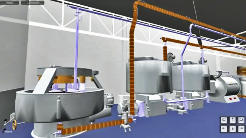
For Task #2 (building prototypes), I use classic graphic design principles to produce static or interactive software prototypes that distill research into clean User Interfaces. More often than not, my contributions help scientists refine their ideas. To me, it's all about communication. Does the UI tell the user what they need to know? Can the user tell the UI what it needs to know?

FXPAL, like all research labs, evolved along with the technologies it investigated. By 2020 we were building as many devices as applications. This lead to an unexpected evolution of task #1 (illustrating concepts). In the past I might produce some concept art based on a physical prototype in the lab. As the illustrations became more refined, I generally built detailed 3D models of the imagined devices. Before the "maker revolution", my 3D models existed only to produce still and animated artwork. Now, I'm being asked to actually build some of the things that I illustrate.


In 2014 and 2015 a group of researchers and I worked on a robotic telepresence device called Jarvis. The same 3D files that I created to make illustrations and animations of the device were repurposed to laser-cut and 3D print the pieces used in its construction. We went through nine different iterations of the design, but only had to build three physical prototypes. The 3D renderings and animations improved the actual physical design, and vice versa. Any time we needed to build a physical prototype, we already had refined 3D files.
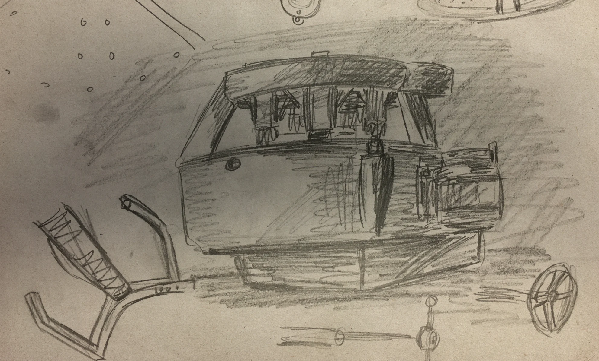
In 2016 I produced a series of quick concept renderings depicting telepresence and document sharing devices. One of these illustrations featured a floor lamp design.
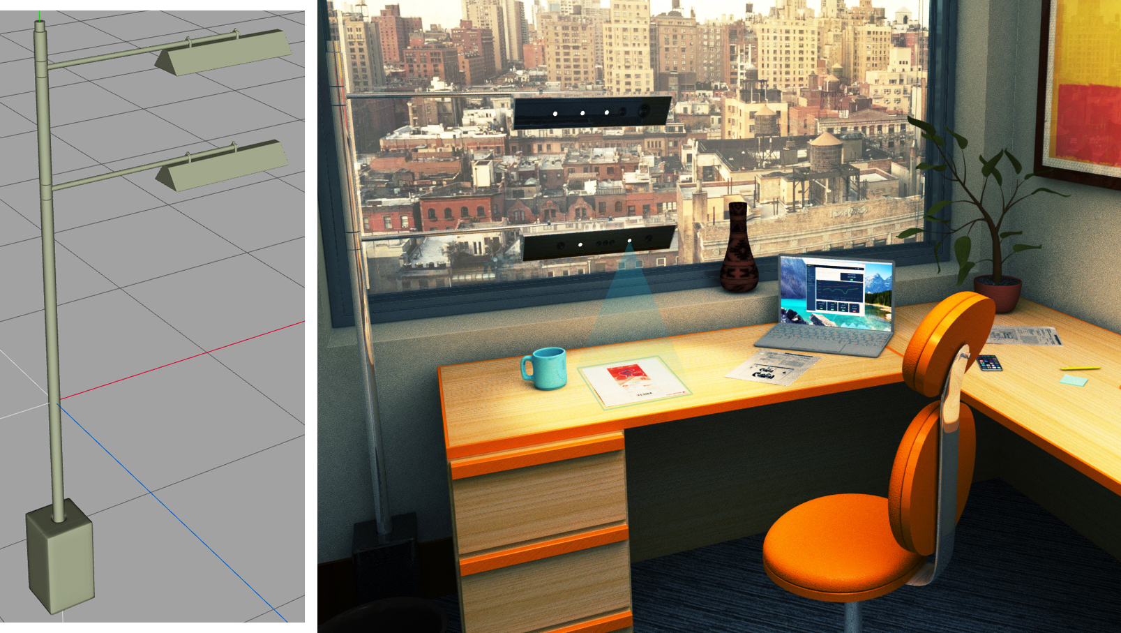
This design was actually something that FXPAL could use as a platform to evaluate core technologies. I was asked to build one. This involved designing and 3D printing various pieces that attach hardware to the lamp's frame. I also worked with a talented metal fabricator and a company that makes custom lampshades. This resulted in a simple, highly customizable test-bed for a collection of related technologies.
Drawing lets me work through designs very quickly. It enables me to share my work as I go. I make dozens of sketches, often while I'm meeting with the researchers involved. This way, most of the basic engineering problems have been resolved before I ever start working on a CAD file. I suppose this has become my Task #3.

Research scientists come up with all sorts of crazy ideas. Artists can visualize and build those ideas.
Artists come up with all sorts of crazy ideas. Research scientists can visualize and build those ideas.
Both statements are true.
This video depicts the process I discussed above in the context of one project: Tabletop Telepresence. The video covers work that spans just over six years.