**According to a long forgotten issue of the long forgotten Microsoft Magazine.
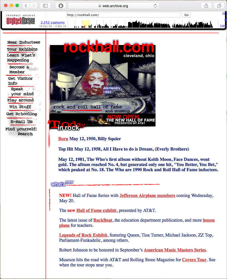
This is my 1997 Design for www.rockhall.com
Here it is: Vintage 90's web design. I was the lead designer for the Rock and Roll Hall of Fame and Museum's website in late '96 through the summer of '97. The same basic design was used until early 2000. Back then, I was working under the multimedia director of a Cleveland based design firm called Vantage One Communications Group. Not long after the site went live it was modified a bit. I remember being very upset by the changes. I felt like the revised version compromised my design, my rock & roll fantasy. Which is funny, since I ended up working for a pretty bad company a few years later. But anyway...
Rockhall. Com as it appeared from 1997-2000.
I've included both versions of the homepage in this post to illustrate a point. I cared about this site. The people at the Rock and Roll Hall of Fame cared about this site. We all worked hard to produce something that would be informative and cool to look at. Today, both versions look so antiquated that its hard to believe that I thought that one was better than the other. I have to remind myself that this was a successful project that was well received by critics and viewers. It was probably even "bleeding edge". To be honest, I had mostly forgotten about this website. Luckily Vantage One's old site is available through archive.org. On it, I found the following list of accolades.
It was named one of the top 10 sites ever created on the Web by Microsoft Magazine
The site was named "Cool Site of the Day" by InfiNet (Billed as a Grammy Award for the Net). That day, the site received more than 850,000 hits (a great number back then) in a 12-hour period.
USA Today highlighted the site during the week of the launch
CNN featured it as part of a segment on the Rock Hall's opening
AOL named it "Cool Site of the Week"
Netscape had the site on its "What's Hot" list for nearly six months.
For a "cool site of the day" (week, six months and ever) this thing has aged pretty badly. It's in good company, most of it's contemporaries look just as sad. Spend a few minutes on the Internet Archive site and you'll see what I mean. Why is that? Obviously there were huge technical limitations. Getting text and images to look the same on different peoples' computers was much more difficult back them. I remember spending hours indexing the colors of the GIF images. The files sizes had to be incredibly small to allow for any animation over 28.8. I had to fight for a target resolution of 800x600. 640x480 was more common. Now websites are almost resolution independent.
I think something else is going on too. In the 90's, there wasn't a sense of what a website should be. The look and feel of most websites was a nearly unfiltered extension of a company's branding and the whims of a designer. Today, website owners and viewers have definite expectations. Everyone knows what a website is supposed to look like. For the most part, this is a good thing. Navigating websites has become much easier now that the majority of the important links can be found at the top of the page.
At some point in the early 2010's I stopped designing custom websites for small to medium sized companies. Somehow, the whole business started to feel like a waste of their money. We'd work together for weeks. Very skilled programmers would help us realize our complex goals. In the end, most of the sites look about like something that could be achieved with a modern template. Templates...
I remember the early templates. They were awful. Cheapskates would fill them with clipart and blinking headlines. Over time, those crummy templates were refined. The bad ones faded away while the better designs were iterated upon by hundreds (thousands?) of designers and coders. Good ideas from multiple sources have been combined into the suite of templates that we have access to today. Take a look at the latest batch of Webby award winners. Now take a look at the selection of templates available to you from any blog engine or web hosting service. Pretty close, right? Making good use of these templates still requires the skills of a designer. Photography, illustration and typography still matter. In that way, website design looks a lot like magazine design -- skilled artists working within a framework.
As all of the underlying technologies have matured, a cool thing has happened to web design. It's grown beyond aesthetic design. Creating a truly unique browsing experience involves incorporating technologies that support animation, interaction, mobility, accessibility, content delivery speed and efficiency. These technologies, when presented artfully, produce websites that are unique in ways that I couldn't have imagined in 1996. Luckily, someone did.
Anyway, I'll leave you with this. I designed the website for the Grand Prix of Cleveland, Ohio. The site is old enough that the race got the domaine: grandprix.com (later offered for auction at the reasonable starting price of $500). Ever the innovator, I designed this site to resize with the browser. The main graphic was anchored to the left, the cars were anchored to the right and the rest of the content was centered. I mean, this site looked rad on screens as large as 1024x768.


