• home
  • portfolio
  • resume
  • case studies
  • blogs
  • contact
Menu

Anthony Dunnigan

  • home
  • portfolio
  • resume
  • case studies
  • blogs
  • contact
×

Re-Design

Tony Dunnigan January 6, 2017

Late in the summer of 2015, the Japanese Olympic Committee selected Art director Kenjiro Sano's logo design for the 2020 Olympics. It's a great logo, unfortunately so was Olivier Debie's logo for Théâtre de Liège in Belgium.

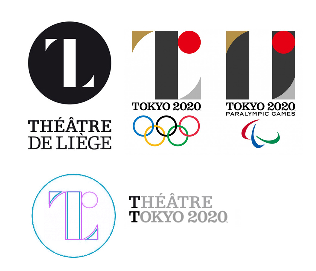
The theft seems obvious, but is it? Modern logos tend to be exercises in simplicity and minimalism... and there are thousands upon thousands of them. I'm inclined to give Kenjiro Sano the benefit of the doubt. Although, I've read that he has been accused of similar "borrowing" before. Whatever the circumstances, Olivier Debie's logo came first. The Japanese Olympic Committee eventually did the right thing when they opted to use a new design. If it was an honest mistake, I'll bet Sano wishes that he'd discovered the similarities before the twitterverse did.

A few years ago, I designed a logo for a company that produces medical equipment. The logo featured a shield incorporating a letter as a stylized reflection. From initial sketch to final art, everything was 100% original. Based on my clients input. Created by me. For sure.

Exept it wasn't. An art student created the same logo a few years earlier. Thankfully, I'm the person who found that earlier design. I had to call my client and explain that the logo they spent time and money on had to be scrapped. It was embarrassing, and I had to spend several unpaid late nights coming up with another design.

I do my best to avoid this sort of thing. While designing a logo, I enter various a descriptions of it in a search engine. I also do searches based on the artwork, variations of the clients name and their industry. If I see anything close, I move in a new direction. Even after all that, I came very close to duplicating someone else's design. I discovered the problem because a new search term occurred to me.

The story of the 2020 Olympics logo illlustrates how hard it has become to create unique logos in today's crowded marketplace. There are steps we can take to avoid Sano's mistake.

1) Base your logo on the unique aspects of your client. When a logo tells a unique story, it has a better chance of being an original design.

2) Create lists of keywords that describe your  proposed logo, your client and your client's industry. Search for logos or icons based on those terms. 

 3) Give Google's "visually similar" image search a try.

4) Ask your client if they've seen a similar design! They know their industry better than you do.

5) Ask the design community. There are several forums devoted to logo design. 


In Design Tags Design, logo, logos, graphic design, olympics, Kenjiro Sano, Olivier Debie, 2020
Comment

IX Power Logo Design

Tony Dunnigan February 12, 2016

I like designing logos, I always have. I must have drawn the classic Star Wars logo a hundred times as a kid, trying to get all the letters and the border just right. Most of the logos I design today are for research projects. That means they have a very short shelf life and a very limited audience. When a friend of mine asked me to design a logo for his energy startup I jumped at the chance to do something more people will see.

I began the project the way I always do, asking questions and making very simple sketches. I follow the "there are no mistakes" philosophy of sketching. I'm just working out ideas. I go back to the sketches after a day or two to mine them for anything I might have missed in the moment. I rarely show these sketches to anyone, even a friend.

IX Power logo sketches

IX Power logo sketches

I produced dozens of Sketches for IX Power (pronounced Nine Power). Some of the themes that emerged were power transmission, like power lines and poles, but also motion. There is also a notion of multiple parts coming together to create power. It was important not to loose the roman numerals. The company is "Nine" Power not Ics Power or I.X. Power.

When I move to the computer I usually work in black and white until the basic shapes are figured out. In this case, purple wasn't negotiable. Early on, my client favored a 3D look. For a while, the logo was going to be the second one from the top left in image above. Even though my friend was happy with the design, I felt like I owed it to him to keep going. This is a tricky spot for a designer to be in. The job is done, but you feel like another round of work is needed. Proceeding can mean working on spec and possibly loosing some billable hours. Luckily, I was able to convince IX Power to spend just a bit more time developing the logo.

The logo we arrived at retains the roman numerals, has some dimensionality and feels stable. Stability, competence and trustworthiness were important concepts to convey. This is a startup doing business in an industry that doesn't tolerate mistakes. The latter stages of the design process were guided by a conversation about how the logo was going to be used. Many people would encounter the logo in the field. It might be on a piece of equipment, the side of a truck or stitched onto a jacket. It had to look modern, but not out of place around logos from traditional energy companies, heavy industry and governments. To me, that meant something bold with elements that are just a bit unexpected—to make it memorable. The finished logo has been very successful for IX Power. As the startup has grown, the logo has been applied across all their business lines.

Finished IX Power logo

In Design Tags design, logo, process
Comment

I've been lucky enough to run along some of the most beautiful trails in the world. I've seen the sun rise over Tokyo and the Milky Way stretch across the Leadville sky.

Like most runners I maintain a list of my personal bests.

  • 200 miles in 67:58

  • 100 miles in 22:59

  • 50 miles in 8:41

  • 50k in 4:42

  • In 12 hour I've run 64.5 miles

  • In 24 hour I've run 108.2 miles

tony@dunnigan.net  |  +1 (510) 682-3761