Every December, I make a card to send to friends and family. Though the images might be weird, the sentiment is not: Happy Holidays.
2024
2023
2022
2021
2020
2019
2018
2017
2016
2015
2014
2013
2012
2011
2010
Every December, I make a card to send to friends and family. Though the images might be weird, the sentiment is not: Happy Holidays.
2024
2023
2022
2021
2020
2019
2018
2017
2016
2015
2014
2013
2012
2011
2010

IKONOS
Research scientists often claim that they aren't creative. They say this, even though the work that they do produces something that didn't exist when they started. The truth is, they are highly creative. Their work inspires my own.
What they really mean is that they aren't "visual". Of course, that isn't true either. All they actually mean is that they can't draw. Drawing lets me work through all manner of design problems in a way that lets others see and comment on the decisions I'm making. It becomes a very collaborative activity. Scientists theorize and artists visualize.
If I'm honest, I've been doing pretty much the same thing since I was a kid. Art is the skill I have, and art is the skill I use to earn a living. Aside from a few forays into the worlds of fast food service, construction and dishwashing, I've been employed as a designer of one sort or another since the 90's. From then until now, my goals haven't changed: Explain whatever my client wants explained as efficiently as I can.
In the early 2000’s I began working with with scientists and engineers at the company operating IKONOS, an Earth observing Satellite. Initially, I was hired to help market their imaging products. As we continued to work together, it became clear that they were having trouble explaining certain concepts. It turns out, I could illustrate those concepts. Space Imaging’s Chief Marketing Officer, John Deal, recognized the value of this work and encouraged me to push it as far as I could. He’s a serial entrepreneur that I’ve worked with many time since.

Initially, I created simple infographics showing the satellite in various situations. In order to depict the satellite well, I built a fairly realistic 3D model of it. The use of 3D models in the illustrations had a side benefit. Those same models could be repurposed for animations. As primitive as the animations look by modern standards, they were actually used in a few national news segments. Including an interview with, then President, George W. Bush. This was a bit of a PR coup for Space Imaging, a small aerospace company. Today, those same models can have a third use: physical prototypes. I can make 3D prints of the same models that I can animate or render as an illustration. The first time I did this was for a San Francisco chocolate factory.
The IKONOS animations lead to an interactive CD-ROM exploring the satellite, it's products and the science behind them. In it, satellite imagery was combined with other data to produce detailed depictions of landscapes, use-cases and collection methods. Though primitive by today’s standards, this CD-ROM was well received. So well, that I was invited to participate in the Geobook project. That was my first real introduction to User Interface Design. I had experience working on games and CD-ROMs, but this was more complex. For it's time, Geobook was a novel way to look at pictures of a location within the context of a map.

Those experiences lead to more work visualizing everything from the the global spread of diseases to the way that a nuclear reactor works. In 2003, I answered an ad for a graphic designer with multimedia experience. FXPAL, a Silicon Valley research lab, needed someone to lead a group of designers producing artwork for an experimental multimedia application. Even a small lab produces a fantastic number of ideas. I quickly found myself jumping from one project to another. In 2004 Lynn Wilcox, then Director of Research, made me a full-time member of the lab.
At that time, FXPAL was almost exclusively conducting research into software solutions for various forms of media creation and consumption. The focus was mainly on multimedia documents in the workplace. From the beginning, my own work fell neatly into two categories:
1) Make a video or illustration that explained a concept.
2) Make a research prototype more useable.
Task #1 was made much easier by my colleague at the lab, John Doherty. John had been a professional cameraman and electrician in Hollywood. I studied film in school, but all of my work experience was with video and fairly unorthodox. With his help, I've learned to incorporate all of the 3D and illustrative skills I can muster into "vision videos"—videos that describe not just a technology, but an imagined application of that technology.
Much of that work is captured in this demo reel. These videos grew to be, more or less, mini documentaries about emerging technologies. Special effects were employed when filming the actual technology was impractical. Newer ideas were often harder to depict, even though they relied more heavily on these illustrative videos.
My illustrative work includes everything from detailed concept renderings to logos & icons that encapsulate the intent of the research. I've drawn so many people interacting with so many touch screens...
For Task #2 (building prototypes), I use classic graphic design principles to produce static or interactive software prototypes that distill research into clean User Interfaces. More often than not, my contributions help scientists refine their ideas. To me, it's all about communication. Does the UI tell the user what they need to know? Can the user tell the UI what it needs to know?

FXPAL, like all research labs, evolved along with the technologies it investigated. By 2020 we were building as many devices as applications. This lead to an unexpected evolution of task #1 (illustrating concepts). In the past I might produce some concept art based on a physical prototype in the lab. As the illustrations became more refined, I generally built detailed 3D models of the imagined devices. Before the "maker revolution", my 3D models existed only to produce still and animated artwork. Now, I'm being asked to actually build some of the things that I illustrate.


In 2014 and 2015 a group of researchers and I worked on a robotic telepresence device called Jarvis. The same 3D files that I created to make illustrations and animations of the device were repurposed to laser-cut and 3D print the pieces used in its construction. We went through nine different iterations of the design, but only had to build three physical prototypes. The 3D renderings and animations improved the actual physical design, and vice versa. Any time we needed to build a physical prototype, we already had refined 3D files.
In 2016 I produced a series of quick concept renderings depicting telepresence and document sharing devices. One of these illustrations featured a floor lamp design.
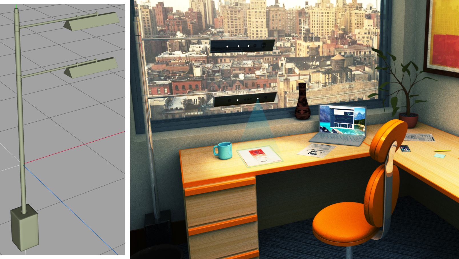
This design was actually something that FXPAL could use as a platform to evaluate core technologies. I was asked to build one. This involved designing and 3D printing various pieces that attach hardware to the lamp's frame. I also worked with a talented metal fabricator and a company that makes custom lampshades. This resulted in a simple, highly customizable test-bed for a collection of related technologies.
Drawing lets me work through designs very quickly. It enables me to share my work as I go. I make dozens of sketches, often while I'm meeting with the researchers involved. This way, most of the basic engineering problems have been resolved before I ever start working on a CAD file. I suppose this has become my Task #3.

Research scientists come up with all sorts of crazy ideas. Artists can visualize and build those ideas.
Artists come up with all sorts of crazy ideas. Research scientists can visualize and build those ideas.
Both statements are true.
This video depicts the process I discussed above in the context of one project: Tabletop Telepresence. The video covers work that spans just over six years.
My uncle is 70 years old. He lives in Cleveland now, but he's lived and worked all over the world. His orbit includes many of the most interesting pop and counter culture figures of 60's through the 90's. He watched the Sex Pistols perform their last show at the Winterland Ballroom & was told to "scram" by an elderly Moe Howard. Unafraid of technology—he built his own Triumph Bonneville chopper in the late 60's. He was never a motorcycle mechanic, just a smart guy who likes to figure things out.
In early in 2017, my uncle got a letter introducing him to all the new features that he was about to get from digital cable. None of these features interested him at all, so he the ignored the sales pitch. He didn't need a DVR, or want to watch anything on a second screen. If he missed a show, life went on. He likes reading the TV guide in the local paper. And actually, he's right about that. Some of the descriptions are pretty funny in a "nobody cares what we write any more" kind of way. On the 4th of August 2017, at precisely midnight, Spectrum Cable (formerly Time Warner, formerly…) foisted all these new digital features on him.
On the 5th of August 2017 all of my uncle's TV sets stopped working. Why? Because these new digital features, that he didn't want, came at the expense of the analog features that he'd been enjoying for years. So yeah, his TVs still work, but Spectrum no longer sends them the analog signal that they were made to display. To help my uncle, I took him to his local Spectrum office to pick up the new equipment that he needed. Upon arrival, we were herded into a corral of "old folks". Each old person was accompanied by a somewhat less old person. My uncle is 70, so he was accompanied by 45 year old me. To be clear, nobody in this line would be considered young by someone in their 20's or 30's (the average age of the staff at Spectrum). Cool water and tarps for shade were provided for our comfort. As was armed security. Seriously, three guys with guns.

When we finally reached a customer service representative my uncle was given a new cable box with a complex remote. By given, I mean that he was leased new equipment. 2 of his 3 televisions don’t have an HDMI port. They require an additional piece of hardware. Again, none of this is bringing him any new benefit. It’s just more stuff he has to do to watch TV. The cable company was actually quite nice about all of this. They patiently explained that his older sets should be replaced, but that they will provide special converters at a low cost. In the end, he got one cable box but didn’t buy the extra converters. His bill still went up, but lost the use of two screens. He pays more for a box that makes his remaining television harder to use and turns the rest into doorstops.
I have digital cable. I stream 4K content from apps on my smart TV. I time-shift my viewing. I use second screens. Everything Spectrum (although I have Comcast) did was to improve the viewing experience for people like me. Unfortunately, this is at the expense of people like my uncle. His new cable box came with a remote that is substantially more complex than anything he has used in the past. The single button operation of turning on the TV now takes three buttons that must be pressed in the correct order. His new remote is filled with buttons that occasionally lead him to features that 1) interrupt his viewing experience and 2) are difficult for him to exit out of.
With a little effort, “classic” TV features could be provided to customers that don’t want anything else. There are simplified remotes. Companies like Flipper make models that seem very easy to use. They cost about $30.00 — or ANOTHER $30.00 as my uncle would say. These remotes do provide the correct level of functionality and should have been an option. With just a little more effort, the necessary digital adapters could be provided to customers in a way that doesn’t make them feel second class.
My uncle is a cool guy. Cooler than me, probably cooler than you. All he wants to do is relax in front of his television. It made me sad to see him placed into the literal corral of annoying old coots. As a paying customer he deserves better. Especially since all he wants is the services that should be at the core of a TV providers business. Namely, TV. Sometimes designing a good user experience takes more than concocting a clever interface that's verified by a well designed user study. Sometimes it requires empathy.
This willingness of technology companies to leave people behind isn’t unique to the cable TV industry. People routinely buy cars with "infotainment systems" that they can’t use. Times change, technology keeps chugging along. The baby boomer generation may not be the target market for some of these new products, but they do have and spend money. They aren't "legacy customers". They are customers.
Late in the summer of 2015, the Japanese Olympic Committee selected Art director Kenjiro Sano's logo design for the 2020 Olympics. It's a great logo, unfortunately so was Olivier Debie's logo for Théâtre de Liège in Belgium.
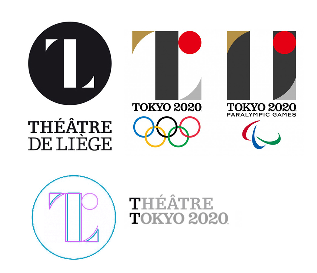
The theft seems obvious, but is it? Modern logos tend to be exercises in simplicity and minimalism... and there are thousands upon thousands of them. I'm inclined to give Kenjiro Sano the benefit of the doubt. Although, I've read that he has been accused of similar "borrowing" before. Whatever the circumstances, Olivier Debie's logo came first. The Japanese Olympic Committee eventually did the right thing when they opted to use a new design. If it was an honest mistake, I'll bet Sano wishes that he'd discovered the similarities before the twitterverse did.
A few years ago, I designed a logo for a company that produces medical equipment. The logo featured a shield incorporating a letter as a stylized reflection. From initial sketch to final art, everything was 100% original. Based on my clients input. Created by me. For sure.
Exept it wasn't. An art student created the same logo a few years earlier. Thankfully, I'm the person who found that earlier design. I had to call my client and explain that the logo they spent time and money on had to be scrapped. It was embarrassing, and I had to spend several unpaid late nights coming up with another design.
I do my best to avoid this sort of thing. While designing a logo, I enter various a descriptions of it in a search engine. I also do searches based on the artwork, variations of the clients name and their industry. If I see anything close, I move in a new direction. Even after all that, I came very close to duplicating someone else's design. I discovered the problem because a new search term occurred to me.
The story of the 2020 Olympics logo illlustrates how hard it has become to create unique logos in today's crowded marketplace. There are steps we can take to avoid Sano's mistake.
1) Base your logo on the unique aspects of your client. When a logo tells a unique story, it has a better chance of being an original design.
2) Create lists of keywords that describe your proposed logo, your client and your client's industry. Search for logos or icons based on those terms.
3) Give Google's "visually similar" image search a try.
4) Ask your client if they've seen a similar design! They know their industry better than you do.
5) Ask the design community. There are several forums devoted to logo design.
VR headsets like Oculus Rift are legitimately amazing. Cnet is right, "This feels like I’ve inserted my head into another world". Once you place the goofy looking visor over your eyes and ears, the sense of immersion is nearly complete. The illusion is so strong that it can induce a kind of vertigo. It feels weird to turn your head and see a VR world rush by. This can be so unnerving that I'd recommend sitting down for the experience.
I've felt that odd sensation of being immersed in another world before. Without chemicals. This is going to get pretty artsy-fartsy...

Yeah, it's goofy looking
The desire to bring viewers into a scene isn't new. In the 1400's Fillipo Brunelleshi introduced linear perspective into his paintings. He, and the countless artists and illustrators that followed him, used variations of the technique to give viewers the illusion of three dimensions on a two dimensional surface. By the mid 1400's artists' understanding of perspective was already complex, enabling them to create convincing 3D arrangements within believable 3D volumes.
Leonardo da Vinci, study for the background of the unfinished Adoration of the Magi
Impressionist painting was the punk rock of the turn of the century art scene in France. The paintings were loud, honest and highly individualistic at a time when the Académie des Beaux-Arts demanded that "the artist's hand" should be invisible. The press hated everything about the impressionists. The establishment really hated them. Even the term expressionist, like punk, was originally an insult. Young artists were drawn to the style. There was something that rang true about the paintings. As it turns out, they ended up influencing everything that followed.
To me, the impressionists did something really cool that no other group of artists had done before. They were able to record the larger environments their subjects existed within. Not just the things on their canvases, but the skies above them and the world around them. By furiously attempting to capture their "impression" of a moment in time, their best paintings transcend the boundaries of a flat canvas in ways that perspective techniques alone couldn't.
Pierre-Auguste Renoir, Dance at Le Moulin de la Galette
If you stare at Renoir's painting and let you eyes relax, you can almost see the sky above Montmartre. By working very quickly, Renoir forced himself to paint only the colors that best represented the light in the environment surrounding his subjects. I really like this painting, but in my opinion the master at capturing an instant in time was Claude Monet.
Claude Monet, Water and Clouds
Obviously, Monet included the reflected the sky and surrounding greenery in this painting of lilies in a pond. He's also managed to paint the ground beneath the water, and the depth of the water itself. The lilies, barely the subject of the painting, are convincingly suspended between the ground and the sky by the surface of the water. If you stare at this image and let your eyes lose focus, you'll begin to have a very 3D and a very VR experience that isn't so different from Oculus Rift.
Claude Monet, Weeping Willow
Monet's failing eyes were operated on in the 1920's. "Weeping Willow" was painted in 1918, while his sight was still dimmed by cataracts. To me, this painting does an amazing job of depicting the environment Monet was sitting in while he painted. This image trades one kind of accuracy for another. Stare at it long enough and you can reconstruct the entire scene in your mind. That's pretty much what a VR headset does. It uses accelerometers, stereoscopic imagery and other technologies to fool your brain into experiencing a simulated environment.
You see bad reproductions of Monet's work all the time. Posters under plexiglass. I'm not an art historian, so take what I say with a grain of salt, but do yourself a favor. Visit a museum and look at one of his canvases in person. Sit down, let your eyes lose focus and have a turn-of-the-last-century-punk-rock VR experience.

A virtual meeting space.
I've been invited to work on an interactive Earth Day exhibit for the Silicon Valley SimCenter and the NASA Sustainability Base. I'd like to design a space, or spaces where people can interact with the amazing images that NASA captures. NASA has released beautiful pictures of our planet on past Earth Days.
I spent a few hours sketching a space to showcase these images. Most of the illustrations are set within the NASA Ames's Visitor Center. A very cool building, but probably not the final location of the exhibit. The actual location will probably be the lobby of the Sustainability Base.
I like the notion of people using Augmented reality (AR) apps to see additional content that is tailored to suit them. One visitor might be interested in global weather patterns while another is interested in scenic photography. AR would provide both visitors with a cool personalized experience.
Augmented Reality
FXPAL, the research lab I work for, is developing a set of technologies called Tabletop Telepresence. Put simply, it's a system that enables video conference participants to share paper documents and other physical objects more naturally. It's comprised of cameras, projectors and a system for controlling everything. Here's a practical example: I can present an English document to the system that is scanned, translated and then projected as a Japanese language document in another location with the original page layout preserved. This allows my colleagues in Japan to read, interact with and even print their own copy. Our lab also researches other advanced telepresence technologies. Another group of researchers and engineers at FXPAL is exploring robotics and methods for very accurately determining locations within a room or set of rooms.
I've incorporated many of these ideas into this next few illustrations. I'd like to provide visitors with a way to share messages with people at other locations. These illustrations depict an exhibit where placing a message under a document camera sends it to other exhibits to be translated and projected. When creating messages, users can also ham it up for a video camera. These video clips would be associated with their message. Later, if another visitor touches the projected message they'll see the video on a large screen. The screen could also cycle through clips.
Tabletop telepresence components of the exhibit
Tabletop telepresence components of the exhibit
I incorporated robots into some of these illustrations. These robots may function as mobile projectors, adding information overlays to the content of the exhibit. They may act as mobile telepresence devices, providing a way for people in distant locations to visit the exhibit. Robots like these would rely on technologies being developed by FXPAL and other labs to navigate the space autonomously and/or be easy for remote participants to control.
Another view of the exhibit that includes telepresence robots
A few hours before our first meeting I sent these sketches to everyone involved. I got some great feedback from people representing the following points of view: The Silicon Valley SIMCenter's goal is to give humanity tools to manage the planet's resources more wisely. Nasa's Sustainability Base is the most energy efficient building ever constructed. Don Kimber's WorldViews is an image and video visualization tool that's in the very earliest stages of development. This input, lead to a whole new idea.
Sketched out very quickly, this decision making game is made up of a tablet/smartphone app and a shared display (the globe in the drawing). People using the app adjust sliders that reflect their environmental impact. The goal of the app is to lower an individual's impact, improving the overall health of our ecosystem. A combination of AR and projections will enable visitors to see the overall health of the environment as well as their specific impact. Beyond that, the app might have an "at home" mode that helps people track their impact over time.
A very quick sketch of an interactive globe
These ideas will continue to evolve. If you'd like to share an idea of your own, or participate in this 2017 Earth Day activity, please leave a comment below.
Recently, I was asked to create a set of icons that represented age and gender. I started with the classic AIGA restroom symbols.

The age brackets I was asked to come up with were pretty standard: 0-12, 13-19, 20-37, 38-63 & 64+. Assuming the AIGA icons represent the 20-37 year old group, the task was to rework them until they represented each of the other age categories. Every icon needed to work within the set, but also on it's own. For example, a smaller version of the standard icons wouldn't do a good job representing a child. You'd probably get the idea if you saw it next to an adult icon, but separately it just looks small. Anyway, I came up with a fairly functional set.

This project got me thinking about those original AIGA restroom symbols. They work really well in a world where gender is binary and iconography can leverage classic stereotypes. Politics aside, many people don't view their gender in these terms. The standard solution for depicting gender neutrality is to cut the classic symbols in half and stick one side from each version together. This modified symbol is often used for gender neutral restrooms.

Depicting gender neutrality is important, but maybe depicting the variation within each gender is important too. Especially where restrooms divide people into binary gender groups. A person with male genitals may identify as female, how can a sign on a door make her feel welcomed in the "Ladies room"? A person with female genitals may identify as asexual, which room is appropriate for them? The LGBT community has a symbol that represents transgender people. Combining this symbol with the AIGA stick figures could express inclusiveness & neutrality. When placed side by side the modified figures still depict gender neutrality, but without the Glen or Glenda connotations of the split & joined symbol. Could these figures could help people feel comfortable enough to choose a restroom that best matches their gender identity? Probably not.

These symbols are becoming awfully complex for bathroom signage and there is a fair chance that many people won't understand the icons. Not only that, the more complex and "inclusive" the symbols become, the more obvious it is that groups have been left out. To me, both versions feel antiquated. Like when your liberal uncle starts talking about legalizing weed. If we're really going to adopt gender neutrality, maybe there's a better solution. A simpler solution. Maybe a pictogram on a bathroom door isn't the right place to depict another human being's sexuality.
Maybe the sign on the door should just represent what's on the other side.


One door leads to larger room for sitting down and the other to a smaller room for standing up.
**According to a long forgotten issue of the long forgotten Microsoft Magazine.

This is my 1997 Design for www.rockhall.com
Here it is: Vintage 90's web design. I was the lead designer for the Rock and Roll Hall of Fame and Museum's website in late '96 through the summer of '97. The same basic design was used until early 2000. Back then, I was working under the multimedia director of a Cleveland based design firm called Vantage One Communications Group. Not long after the site went live it was modified a bit. I remember being very upset by the changes. I felt like the revised version compromised my design, my rock & roll fantasy. Which is funny, since I ended up working for a pretty bad company a few years later. But anyway...
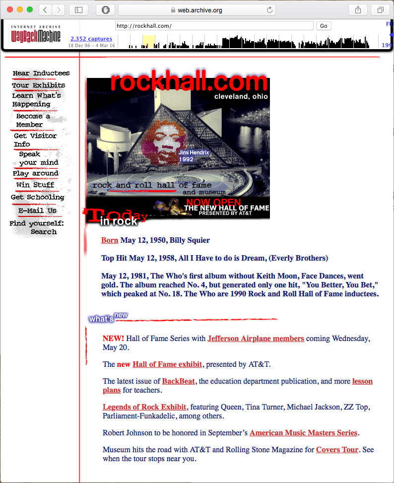
Rockhall. Com as it appeared from 1997-2000.
I've included both versions of the homepage in this post to illustrate a point. I cared about this site. The people at the Rock and Roll Hall of Fame cared about this site. We all worked hard to produce something that would be informative and cool to look at. Today, both versions look so antiquated that its hard to believe that I thought that one was better than the other. I have to remind myself that this was a successful project that was well received by critics and viewers. It was probably even "bleeding edge". To be honest, I had mostly forgotten about this website. Luckily Vantage One's old site is available through archive.org. On it, I found the following list of accolades.
It was named one of the top 10 sites ever created on the Web by Microsoft Magazine
The site was named "Cool Site of the Day" by InfiNet (Billed as a Grammy Award for the Net). That day, the site received more than 850,000 hits (a great number back then) in a 12-hour period.
USA Today highlighted the site during the week of the launch
CNN featured it as part of a segment on the Rock Hall's opening
AOL named it "Cool Site of the Week"
Netscape had the site on its "What's Hot" list for nearly six months.
For a "cool site of the day" (week, six months and ever) this thing has aged pretty badly. It's in good company, most of it's contemporaries look just as sad. Spend a few minutes on the Internet Archive site and you'll see what I mean. Why is that? Obviously there were huge technical limitations. Getting text and images to look the same on different peoples' computers was much more difficult back them. I remember spending hours indexing the colors of the GIF images. The files sizes had to be incredibly small to allow for any animation over 28.8. I had to fight for a target resolution of 800x600. 640x480 was more common. Now websites are almost resolution independent.
I think something else is going on too. In the 90's, there wasn't a sense of what a website should be. The look and feel of most websites was a nearly unfiltered extension of a company's branding and the whims of a designer. Today, website owners and viewers have definite expectations. Everyone knows what a website is supposed to look like. For the most part, this is a good thing. Navigating websites has become much easier now that the majority of the important links can be found at the top of the page.
At some point in the early 2010's I stopped designing custom websites for small to medium sized companies. Somehow, the whole business started to feel like a waste of their money. We'd work together for weeks. Very skilled programmers would help us realize our complex goals. In the end, most of the sites look about like something that could be achieved with a modern template. Templates...
I remember the early templates. They were awful. Cheapskates would fill them with clipart and blinking headlines. Over time, those crummy templates were refined. The bad ones faded away while the better designs were iterated upon by hundreds (thousands?) of designers and coders. Good ideas from multiple sources have been combined into the suite of templates that we have access to today. Take a look at the latest batch of Webby award winners. Now take a look at the selection of templates available to you from any blog engine or web hosting service. Pretty close, right? Making good use of these templates still requires the skills of a designer. Photography, illustration and typography still matter. In that way, website design looks a lot like magazine design -- skilled artists working within a framework.
As all of the underlying technologies have matured, a cool thing has happened to web design. It's grown beyond aesthetic design. Creating a truly unique browsing experience involves incorporating technologies that support animation, interaction, mobility, accessibility, content delivery speed and efficiency. These technologies, when presented artfully, produce websites that are unique in ways that I couldn't have imagined in 1996. Luckily, someone did.
Anyway, I'll leave you with this. I designed the website for the Grand Prix of Cleveland, Ohio. The site is old enough that the race got the domaine: grandprix.com (later offered for auction at the reasonable starting price of $500). Ever the innovator, I designed this site to resize with the browser. The main graphic was anchored to the left, the cars were anchored to the right and the rest of the content was centered. I mean, this site looked rad on screens as large as 1024x768.

In 2008, I was part of a team that built virtual representations of real factories. This project was lead by Dr. Maribeth Back and Dr. Don Kimber with contributions from many other research scientists. Tcho, an under construction chocolate factory, was the subject of our study. Our team traded insights gained for the right to lurk about and eat Tcho’s chocolate. If you’re interested in this research please read: The Virtual Chocolate Factory:Mixed Reality Industrial Collaboration and Control

Panorama of the factory as it existed in 2008-09
It was my job to visualize our work. I sketched and 3D modeled all sorts of machines and their surroundings. This lead to the creation of an interesting set of artifacts. I’ve never had the opportunity to explore a space quite so thoroughly. I crawled up, over and into various machines. I measured and photographed everything I saw.
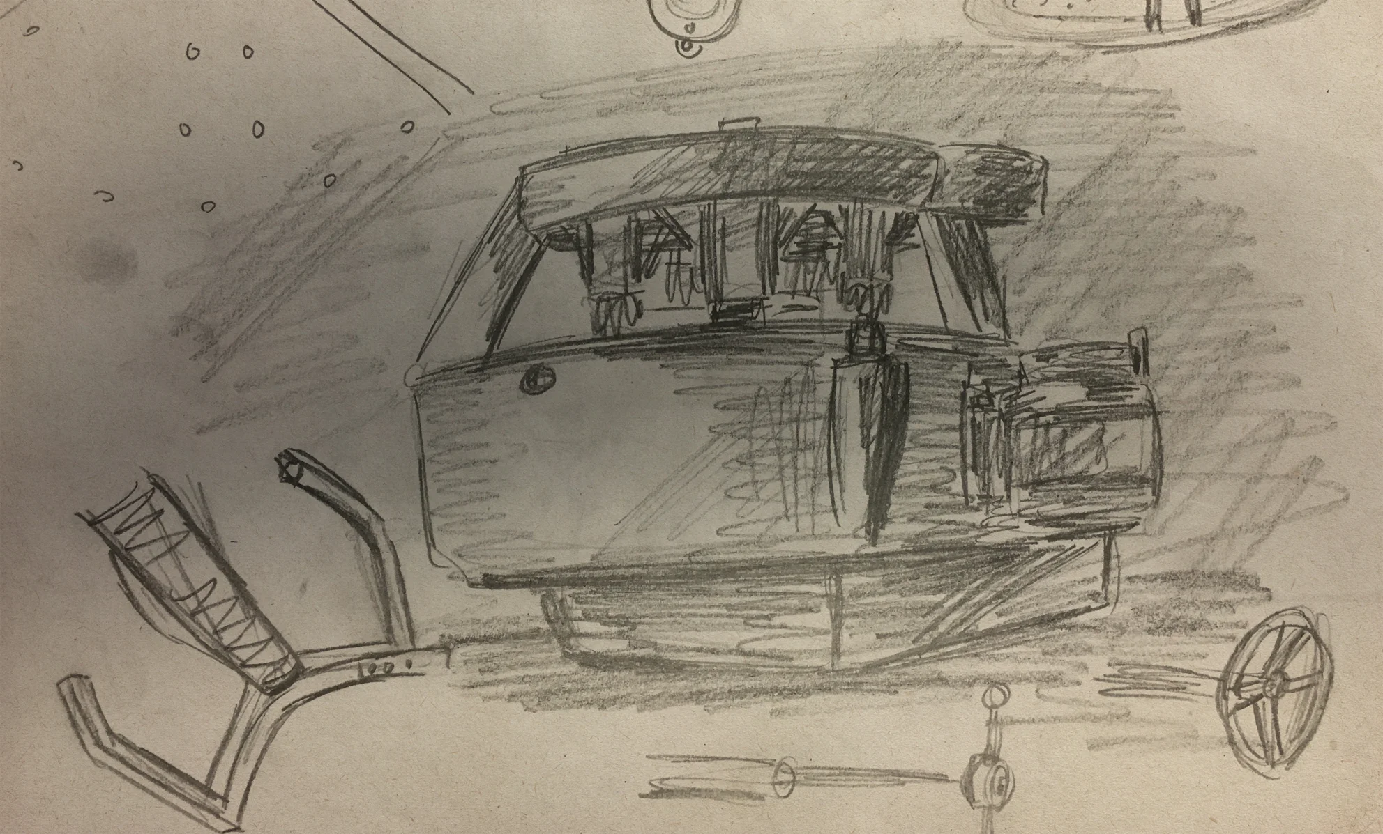
Sketch of a Carle Conch
All of the major elements of the factory were recreated in 3D. Chocolate making isn’t new. Some of the best machinery predates CAD files by decades. Luckily, I was in the factory while much of the vintage equipment was being restored. This gave me access to the inner workings of some beautiful machinery. I was literally able to crawl inside and make very precise measurements.

Inner workings of a Macintyre Conche

Detailed rendering of chocolate making conches
All of this work enabled us to build a virtual chocolate factory. I simplified the 3D models and gave them to a developer who incorporated them into a 3D game engine. Production data from the working factory was integrated into this new virtual space.
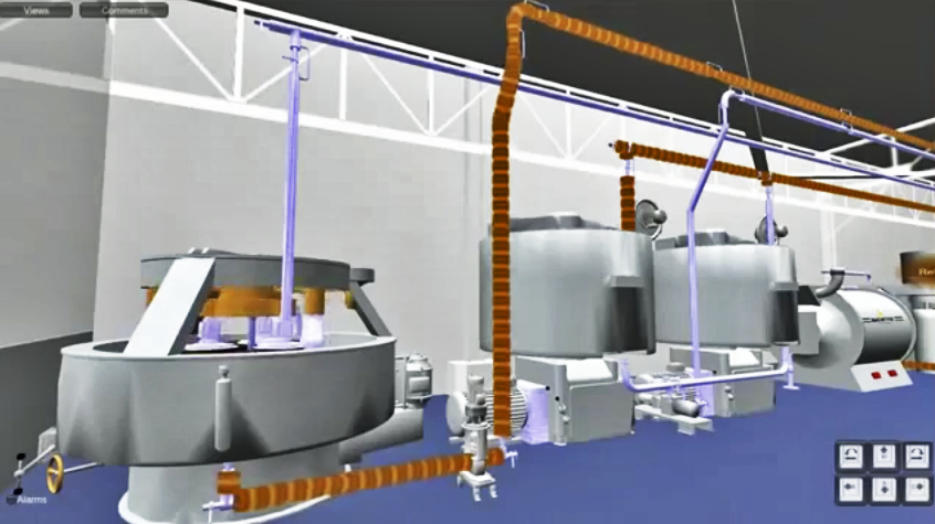
The factory as depicted in a game engine
One of my favorite machines in the factory was the highly articulated Carle Conch. Its a fascinating device that grinds, polishes and heats dry cocoa into liquid chocolate.

With all of its exposed moving parts, the conch is an interesting machine to watch. The 3D model I built was fully animated.
We discussed creating smaller versions of the chocolate making machinery. Something a user could hold, perhaps as a way of interacting with the VR space and vicariously the real space. I modified the conch model so that it could be 3D printed. The result was an accurate small scale replica of the original.
3D printed model
Virtual, real, virtual... it all gets a bit blurry after a while. As the project developed, the notion of what a virtual factory might be drifted. One of the more successful offshoots of the project was this simple smartphone app.

Mobile application
I like designing logos, I always have. I must have drawn the classic Star Wars logo a hundred times as a kid, trying to get all the letters and the border just right. Most of the logos I design today are for research projects. That means they have a very short shelf life and a very limited audience. When a friend of mine asked me to design a logo for his energy startup I jumped at the chance to do something more people will see.
I began the project the way I always do, asking questions and making very simple sketches. I follow the "there are no mistakes" philosophy of sketching. I'm just working out ideas. I go back to the sketches after a day or two to mine them for anything I might have missed in the moment. I rarely show these sketches to anyone, even a friend.

IX Power logo sketches
I produced dozens of Sketches for IX Power (pronounced Nine Power). Some of the themes that emerged were power transmission, like power lines and poles, but also motion. There is also a notion of multiple parts coming together to create power. It was important not to loose the roman numerals. The company is "Nine" Power not Ics Power or I.X. Power.
When I move to the computer I usually work in black and white until the basic shapes are figured out. In this case, purple wasn't negotiable. Early on, my client favored a 3D look. For a while, the logo was going to be the second one from the top left in image above. Even though my friend was happy with the design, I felt like I owed it to him to keep going. This is a tricky spot for a designer to be in. The job is done, but you feel like another round of work is needed. Proceeding can mean working on spec and possibly loosing some billable hours. Luckily, I was able to convince IX Power to spend just a bit more time developing the logo.
The logo we arrived at retains the roman numerals, has some dimensionality and feels stable. Stability, competence and trustworthiness were important concepts to convey. This is a startup doing business in an industry that doesn't tolerate mistakes. The latter stages of the design process were guided by a conversation about how the logo was going to be used. Many people would encounter the logo in the field. It might be on a piece of equipment, the side of a truck or stitched onto a jacket. It had to look modern, but not out of place around logos from traditional energy companies, heavy industry and governments. To me, that meant something bold with elements that are just a bit unexpected—to make it memorable. The finished logo has been very successful for IX Power. As the startup has grown, the logo has been applied across all their business lines.
Finished IX Power logo
Reprinted from my blog posting at: http://palblog.fxpal.com/?p=5648
Jony Ive is a fantastic designer. As a rule, his vision for a device sets the trend for that entire class of devices. Apparently, Jony Ive hates skeuomorphic design elements. Skeuomorphs are those sometimes corny bits of realism some designers add to user interfaces. These design elements reference an application’s analog embodiment. Apple’s desktop and mobile interfaces are littered with them. Their notepad application looks like a notepad. Hell, the hard drive icon on my desktop is a very nice rendering of the hard drive that is actually in my desktop.

This push for increasingly intricate user interface elements might have served a UX purpose, but it was fueled by our computers’ ever increasing ability to create and display large complex graphics. On mobile screens, where every pixel is precious, simple pictographs can be a more efficient communication tool than a more complex 3D rendering. With the advent of high density displays these pictographs are becoming quite beautiful. Jagged lines and blurred details are replaced by a crispness that really suits these simpler icons. Microsoft’s Metro interface is often a very pretty thing to look at. This simple style is showing up in print, video and even in fine art. The fact that these pictographs might evoke anything from cave paintings to Andy Warhol to Super Mario certainly aligns with the current post-millennial aesthetic. I’m sure Jony Ive noticed.

Those old skeuomorphs are the decedents of a decorative painting style called trompe l’oeil or “fool the eye.” Mural artists often used this technique to create very realistic frames around their painted scenes. Interior decorators created intricate architectural details on flat walls. In both cases trompe l’oeil was used to communicate something about the space and the objects within it. In this way, a drab wall with a picture painted on it could become an ornate gallery with artwork that should be admired (not leaned against). Skeuomorphism did much the same thing for the original iPhone. Back in 2007 it helped users understand this very new “Internet Communications Device”.

Take a look at your smart phone. Don’t turn it on just look at it. What does its form suggest? Does it look like a camera? A television? A game? A phone? Mine looks like a small black rectangle with fingerprints on it. If I look closely there are a few small buttons and holes. Its form really doesn’t suggest its function, which is ironic because its form is dictated by its engineering. Apparently Scott Forstall and others at Apple chose to address this problem by incorporating skeuomorphic design elements into the user interface of the iPhone (and later the iPad). Apple has a long history of solving its “Keep it simple” aesthetic with a dose of realism. Rumor has it that Jony Ive will put an end to this policy. What will that mean? Visually, were told that the new iOS will be flatter and less cluttered. Sounds good, right? On a device that doesn’t look like it does anything all those little bits or realism suggest functionality. Those realistic elements “fool the eye” into seeing classic analog objects within an anonymous black box. These objects link that box with the act of taking a notes, playing a game or reading a book. So, maybe Scott Forstall was right. Maybe we do need a few corny graphical elements here and there. On the other hand, how long will graphical elements based on archaic objects be relevant? Is relying on them to convey information shortsighted?
Reprinted from my blog posting at: http://palblog.fxpal.com/?p=4389
For about 20 years the cast of Mystery Science Theater 3000 has been entertaining science fiction fans with funny commentaries of bad movies. The concept is strangely simple: mad scientists (at various times: Trace Beaulieu, J. Elvis Weinstein, Frank Conniff and Mary Jo Pehl) have launched a man (Joel Hodgeson and later Michael J. Nelson) into space and are forcing him to watch the worst movies ever made. To keep his sanity, the unfortunate spaceman and his robot friends (at various times: Beaulieu, Weinstein, Kevin Murphy, Bill Corbett and Jim Mallon) make fun of these movies. The original show was canceled about 10 years ago but most of the people involved are still riffing on cheesy movies – “the worst they can find”.
One group of original cast members has formed a comedy troupe called “Cinematic Titanic” (Joel, Trace, J. Elvis, Frank and Mary Jo). Basically, they do a live version of the original show (minus the robot puppets). Recently I caught a performance in San Francisco. It wasn’t surprising that the group was as funny as ever. What was surprising was the fact that all of the performers were holding iPads. They didn’t make any sort of announcement about it. They just sat down and started to to read from them. They have always used paper scripts — even during live performances — so I was surprised to see this revival of a 90’s era show using such 21st century devices.
I wanted to learn more about this so I contacted Glenn Schwartz, their PR person. He explained that the iPad solved several longstanding problems involving the creative process, performance and even travel.
During their creative process the cast will watch a bad movie and write down any jokes that come to mind. These are then sent to one cast member, Weinstein, who compiles them into a script. The script is then emailed to each cast member’s iPad. They view the script in a PDF viewer and may make changes, which are shared via email directly from the iPads. The PDF reader allows each cast member to highlight their part and to make notes. The immediate effect of this is a tremendous reduction in wasted paper. It also allows for a very rapid iterative process even though all the participants are in different locations.
Apparently Apple has done an excellent job designing the UX of their PDF reader. The interaction is so natural that the cast is able to use it as if they were reading a paper script (paging to appropriate sections and etc). A side benefit of the glowing screen is that each performer is self illuminated, requiring much less stage lighting, if any at all. I was surprised to learn that the iPads are not synchronized to each other or to the film. The performers simply “turn the pages” of their scripts as necessary.

The troupe’s five performers each need an updated script. These scripts are fairly lengthy (and heavy), weighing in at about 50 lbs a set. Now that the cast uses iPads they’re no longer obligated to carry all that extra weight around. They simply bring along their iPads, something they would have probably done anyway for their own personal use.
Clearly the Cinematic Titanic troupe would benefit from a more integrated solution. Imagine if our own XLibris were an iPad app that was extended to include more collaborative features. A cloud version might enable these performers to iterate through changes in an even more natural way — retaining their local changes while automagically pushing or pulling in important global changes.
I wouldn’t be at all surprised if a technology very much like this became the standard way that scripts are distributed. Xerography made quickly revising and distributing scripts possible; some form of XLibris on an internet-enabled tablet might make it even easier and faster.
This is just one example of the way these technologies enable people to work collaboratively. Cinematic Titanic’s ad hoc script writing process isn’t very different from the way researchers might prepare a paper or the way a sales team might prepare a presentation. A robust, document-centric application that supports annotation and collaboration running on a lightweight tablet might well be that killer app we’ve all been looking for.